Category Archives: Rhetoric on the Town

Rhetoric on the Town: Website

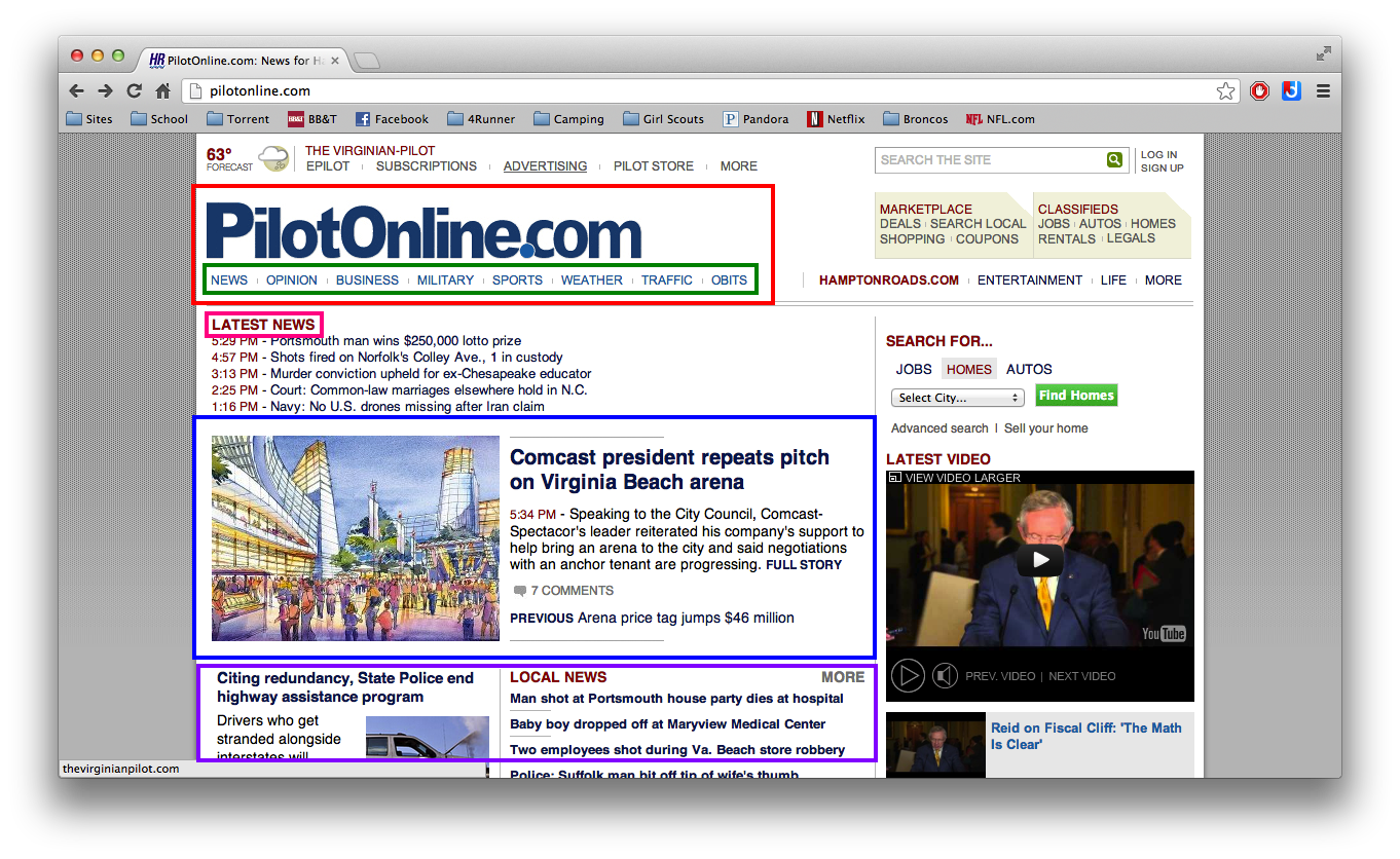
I choose to analyze the Virginian Pilot’s website Pilotonline.com.

purpose/audience

The main purpose behind this website is to inform the public of any local or world news.  It’s secondary purpose is to provide people with a digital copy of the Virginian Pilot if they do not receive the traditional newspaper at home.  It’s audience ranges from all ages, but I would say it’s main audience would be people from 16-70 mainly because of it’s technology.  The audience would most likely live in the area covered by the paper of could even be locals who have moved away and like to keep up to date on things happening in Virginia.  The educational background of the audience would most likely include people who had at least graduated high school or attended some high school, but could range to higher education levels as well.

copyright and attributions

The main website is copyrighted to Hamptonroads.com and Pilotonline.com because they are the owners of the website.  Each story on the website is submitted by different reporters so the website is sure to give them credit at the top of the story along with whoever they are affiliated with.  Photos are treated the same way.  The photographer or artist is given credit for their work as well and in most cases this credit can be seen in the caption included with the photo.

The red box contains the website’s copyright information

design elements

In the above screenshot of the website several different design elements can been seen.  In the red box the design element of contrast can be seen.  This element works best here as the header because the word “PilotOnline.com” is larger and in a bolder font than everything else on the page.  Moving down to the green box the viewer gets the design element of repetition.  The different page titles are all in the same color, font size, and font type giving them unity.  The repetition design element works with page titles because all of the titles are portrayed as the same so the user is not influenced to click on any title unless it is something that they are interested in.  Under the green box you’ll see the pink box which represents emphasis.  Emphasis is placed on the “Latest News” link because it draws the eye of the viewer.  This design element of emphasis also works well here because most of the time when visiting a site like this the viewer is looking for the latest news so this cuts down the time they may be spending looking for it.  Now to alignment which is highlighted in the blue box.  The whole website displays alignment but this specific area has a photo to the left of the article.  The article summary and photo are about the same size because the tops and bottoms line up almost perfectly.  Last, but not least, is balance which is seen in the purple box.  Balance is displayed in the two columns and keeps the page from being nothing but a large box of text.

 

Rhetoric on the Town: Alignment

Subaru Impreza Advertisement


rhetorical analysis:

The main purpose for this advertisement is to sell the car Impreza which is made by the automobile maker Subaru.  Due to the wintery environment of the advertisement some of the targeted audience may live up North or in places that receive high amounts of snowfall.  The fact that it’s a car and driving in snowy icy conditions may attract the audience of people who are looking for safe cars who have lots of traction.  Since the ad actually states the base price of the Impreza it shows that the target audience would not be the upper class, but would in fact include the middle class or people who are just starting off in careers that may not be making the big bucks yet.

design element analysis:

This advertisement’s main design element is alignment.  The car, description of the car, “headline,” and price are all left aligned.  The only item on the advertisement that is right aligned is the company’s name which is “Subaru” and the Subaru symbol.  The alignment element works because since the majority of the advertisement is aligned to the left and leaving only the company’s name right aligned the reader’s name is naturally drawn that way.

Rhetoric on the Town: Contrast

Vintage Toyota Tundra Advertisement

rhetorical analysis:

The main purpose of this ad is to sell and promote the Tundra from the automobile makers Toyota.  The audience for this advertisement is most likely men, and the audience could be narrowed down even further to upper class men.  One way you know this is aimed at men is because of the statement “Power and efficiency. Like steak and eggs.” which can be viewed as a meal common for most men.  Another indicator that the advertisement is aimed at men is because of the color scheme used for the advertisement.  Black, yellow, and white can be considered masculine colors.

design element analysis:

The main design element seen in the advertisement is contrast.  The bulk of the ad is black lettering on yellow background which allows the text to stand out.  The black tundra placed on the yellow background also stands out to the viewer.  The actual name of the truck which is Tundra is seen down at the bottom placed in a black box with white lettering which makes it stand out from the rest of the ad.

Rhetoric on the Town: Balance

Finding Nemo movie poster

rhetorical analysis:

The main purpose for the movie poster is to advertise and build hype for the release of Finding Nemo into theaters.  The audience for this advertisement varies.  The main audience would of course be younger children maybe 5 and up and parents of children that fall into this age group because it is an animated movie.  Another audience would be for people who saw Monsters Inc because it is mentioned that the creators of Monster Inc also created Finding Nemo.

design element analysis:

The main design element seen in this advertisement is balance, symmetrical balance to be exact.  If the poster were to be folded in half the sharks face would be divided equally.  Another balance feature seen is that everything is centered and flows toward the bottom.  These elements work because they draw the viewers eyes towards the bottom where the poster displays the release date.

Rhetoric on the Town: Repetition

An advertisement for Kmart

Purpose: The purpose of this advertisement is actually for Kmart and shows some of the products that Kmart has to offer.  In a way this advertisement can be for more than one product, but it is mainly for Kmart and that products that can be found in the store.

Audience: The audience for this advertisement would have to be a younger, outgoing going crowd and could be male or female.  This conclusion is drawn because all of the people depicted in the advertisement are young and even two of them have brightly colored hair.  Also the products depicted, Sunkist, Slim Jims, and Tide are most likely things you’d find in a house with younger or college aged people.

After viewing the advertisement: Once the viewer has seen the advertisement it may make them want to go to Kmart and buy all of the products depicted in hopes that they will be as outgoing as the people in the advertisement.

Design element: The design element seen most is repetition.  Throughout the entire ad there is only the same basic colors, red, orange, and yellow with very few other colors mixed in.  The ad also repeats the stacking of products, stacked soda boxes, washing machines, Tide boxes, and Slim Jims in the shopping cart.  Repetition works for this ad because the products all have the same basic colors which makes the ad stand out.

Rhetoric on the Town: Emphasis


An advertisement showing the Toyota 4Runner


The purpose of this image is to help boost the sales and get people interested in Toyota’s 4Runner.

Target audience would be people who enjoy the outdoors, there are some woods on the bottom of the advertisement, and the more obvious audience is people who enjoy fishing because of the boat being towed by the SUV and the picture of fish on the advertisement.  There is a ‘compass symbol’ on the left side and the background resembles that of a used map which may target people who like to camp or go off road.

  • Emphasizing the words “You in?” which can be taken in two different ways:
    • The words sort of wrap around the vehicle so Toyota could be implying if you could see yourself in the new 4Runner
    • The second way it can be seen is if you were interested in participating in the activity of fishing
  • The background of the advertisement looks worn which suggests that the 4Runner can be rugged
  • The color of the 4Runner really stands out on the ‘bland’ background
  • Larger boat emphasizing the towing capacity of the 4Runner